Hello!
I hope you’re off enjoying what I consider the best season of the year besides Spring – good ole Summertime! 😉
What have I been up to these days? Just returned from a super fun-filled family trip to the West Coast and I’ll be sharing some of those pictures soon. I’ve been busy working on designs for a book I’m contributing to due out later next year – really excited about the huge dose of inspiration & information this one will offer. This week I’m getting settled in to my summer routine at the beach with the kids.
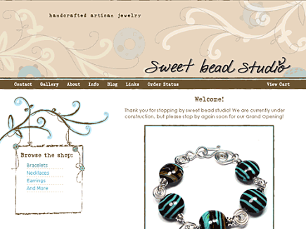
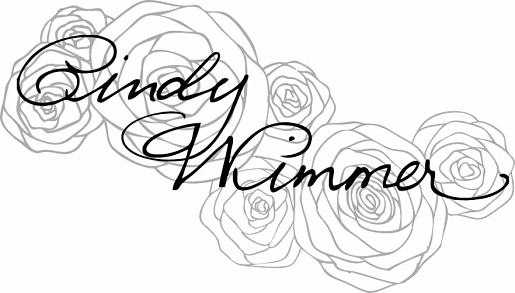
Remember last month when I mentioned that I was working on a new logo/brand? Yes, I want to completely redo things around here and I’m going to share all of the details. Maybe too many details. But some of you may be thinking of a redo/revamp/rebrand too. sweet bead studio has had this current design for over 4 years! And it’s hard to believe I have been blogging for more than 6 years now. Here is my original website created by Arianne over at Aeolidia. Does anyone remember this beginning back in 2007? The banner and graphics were made by “designs by jessi” (she was a teenager in Australia at the time!) – I no longer have a link to her portfolio unfortunately, but I’m sure she’s continuing her artistic journey. Those are lampwork beads you see in the graphics! 🙂 I loved this sweet design, but eventually changed it to use the images you see now by Sadie Olive. My incredibly talented web designer, Andrea Arden, has helped me through the years and is the person behind the scenes really making all the changes happen.
Today I continue to prefer basing my logo design around my own handwriting, just as I did back in 2007. I think this is the perfect way to infuse a bit of your own personality in to your brand. Not to mention knowing no one else is sharing the same font for their websites! I blogged about this process back in my post on Typography. This Spring I worked with a Nila of Halftone Studio, a fantastic designer over in England. She does such beautiful, cutting edge-looking work in branding and graphic design. She took variations of my signature and combined them to make a vector file I can now use anywhere. It was her custom work that really drew me in – in particular her watercolor paintings. I commissioned Nila to make a set of water color roses and they were stunning. Initially I thought I would add watercolor graphics to my site, keeping it crisp and white with a bit of color in my favorite shades of blue. Eventually though I decided to forego the watercolor graphics, as I’m not sure they blended well with the vintage edge I have with many of my designs and photos. I will be using them here and there at some point though because they are just so pretty.
![]()
![]()
My signature, the color (aqua/teal/turquoise) and one more element have been the key players in my logo creation process. I wanted to add roses. Roses have symbolism tied to beauty, romance, new beginnings, and religion. And did you know that roses became the national flower for the Untied States in 1986 (apparently they can be found in all 50 states)? Above all else, I wanted to add roses to honor and remember my paternal Grandmother, Rose. She inspired me with her creative talents from sewing and crochet, to baking and decorating for every season. I sure miss the love and pride I saw in her eyes. I feel like I’m continuing the McGinnis tradition with my love of handmade details – and staying up til the wee hours. Roses are my favorite flower for good reason.
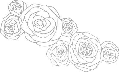
My friend Kerry has been a real sounding board for logo ideas just as she was back in 2007. 🙂 She knew I wanted to incorporate roses and thought of me when she saw a multi-rose stamp in the craft store. She suggested an overlay with my name – and it really seemed just right. Now I had a concrete logo concept and could hit the ground running (isn’t that the hardest part – narrowing down many ideas?). I then searched for an artist to illustrate roses just for me, my very own version. I moved away from the vintage rose concept and wanted a group of roses with more of a modern look.
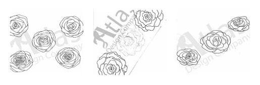
I found Josh over at Atlas Design Company with his new shop on Etsy. Josh has incredible drawing talent and works with clients to create custom illustrations for everything from logos to clothing. He also has the patience of a saint. Through many messages back and forth, he reworked the rose illustration until they were just right and matched the vision I had in my mind’s eye. Here a few of the sketches along the way –
It feels great to finally have a new logo that I love. And what a community effort it was! 🙂 You’ll be seeing these soon around here, but decked out in blue.
Thank you for trekking with me through this super long post. It’s not every day that I make big changes around here and this one is important to me. 🙂 Anyone else have redesigns or new logos? I would love to hear your story too!
– Cindy xoxo
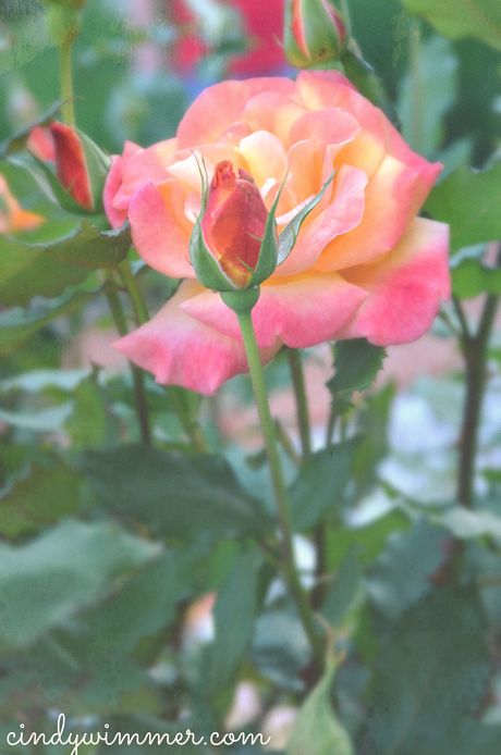
Roses from my Mother in Law’s garden
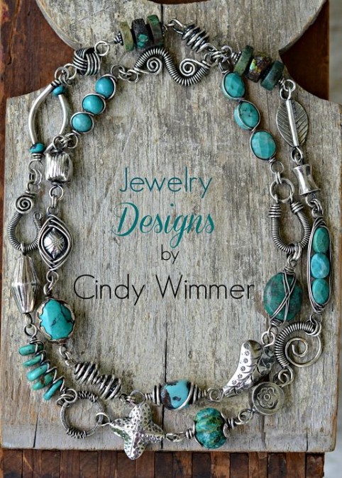
Cindy Wimmer is a jewelry designer with a passion for combining vintage elements with modern wire design. She is the co-founder of artBLISS, hosting jewelry and mixed media workshops in the DC area. Her first wire jewelry design book will be released in the fall, 2013.


